SPFx + React: Complete Developer Guide
Build production SPFx solutions with React architecture: components, hooks, services, PnPjs, Graph, Fluent UI, error handling, performance, and testing.
- Published
- Reading time
- 22 min read
What you’ll learn
- React's role inside SPFx
- Project architecture
- Web part to React
- Functional components
- Props
On this page (62 sections)
Direct answer: React is commonly used to build the user-interface layer of SPFx solutions — but production SPFx development requires more than placing all logic inside one React component. A maintainable solution separates presentation, state, business logic, SharePoint access, Microsoft Graph access, external APIs, configuration, and error handling across components, hooks, and a service layer.
React should manage the UI — not become the entire application architecture. Components render; hooks hold stateful logic; services own data access. Everything in this guide serves that separation.
- SPFx web part — context, properties, lifecycle, platform integration.
- React application — components composed from props and state.
- Components — focused, typed, reusable presentation.
- Hooks and state — loading, data, error, and interaction state.
- Service layer — PnPjs, SharePoint REST, Microsoft Graph, external APIs.
This guide assumes working JavaScript and TypeScript and teaches SPFx-specific React architecture — not React basics, not Hello World scaffolding. For the full lifecycle, use the SPFx complete guide; for navigation, the SPFx hub; for legacy migrations into this architecture, Script Editor to SPFx modernization.
React's role inside SPFx
Three layers with three jobs. The SPFx web part class provides context, lifecycle, property pane, platform integration, and configuration. The React tree owns UI, composition, state, interaction, and rendering. Services own data access, Graph, SharePoint, external APIs, and reusable business operations:
- SPFx web part — provides context and properties.
- Root React component — receives only what it needs as props.
- Child components — compose the experience from typed props.
- Services — fetch, map, and guard Microsoft 365 data.
- Microsoft 365 — SharePoint, Graph, and business systems behind services.
Responsibility leaks — context globals, API calls in render paths, business rules in JSX — are the root cause of most unmaintainable SPFx solutions this guide prevents.
Project architecture
A recommended example layout for a feature such as an employee directory. This is an example, not a mandatory Microsoft structure — adopt the layering even if your folder names differ:
src/
  webparts/
    employeeDirectory/
      EmployeeDirectoryWebPart.ts
      components/
        EmployeeDirectory.tsx
        EmployeeCard.tsx
        EmployeeList.tsx
        LoadingState.tsx
        ErrorState.tsx
      services/
        IEmployeeService.ts
        EmployeeService.ts
      models/
        IEmployee.ts
      hooks/
        useEmployees.ts
      utils/
      loc/
Components render; services fetch; models type the boundary; hooks hold stateful logic; utils stay pure; localization files hold every user-facing string. Each layer exists so the others stay small and testable.
Web part to React
Pass only what components need — context pieces, title, configuration, display settings — as typed props from the web part's render method. Never make the application depend on global state or hand the entire context object to every component:
public render(): void {
  const element: React.ReactElement<IEmployeeDirectoryProps> =
    React.createElement(EmployeeDirectory, {
      title: this.properties.title,
      service: this._employeeService,
      displayMode: this.displayMode
    });
  ReactDom.render(element, this.domElement);
}
The web part constructs the service once (dependency injection without a framework), injects it as a prop, and disposes rendering on unmount. Components stay portable because their inputs are explicit.
Functional components
Use functional components for primary examples and new code — the modern pattern supported across current SPFx React versions. Components receive props, hold state, handle events, and delegate data work to hooks and services:
export interface IEmployeeCardProps {
  displayName: string;
  jobTitle?: string;
  onSelect?: () => void;
}

export function EmployeeCard(props: IEmployeeCardProps): JSX.Element {
  return (
    <article>
      <h3>{props.displayName}</h3>
      {props.jobTitle && <p>{props.jobTitle}</p>}
      {props.onSelect && (
        <button type="button" onClick={props.onSelect}>
          View profile
        </button>
      )}
    </article>
  );
}
Props
Props are typed inputs flowing parent to child. Prefer readonly semantics, explicit optional markers, and callback props for child-to-parent events:
export interface IDocumentListProps {
  readonly siteUrl: string;
  readonly pageSize: number;
  readonly onDocumentSelected?: (id: number) => void;
}
Clear prop interfaces document the component contract: what it needs, what is optional, and what it emits. Components that accept the whole world as props cannot be reused, tested, or reasoned about.
State
State holds UI and interaction truth: loading flags, selected items, search queries, retrieved data, dialog state, filters, and pagination. Never store values in state that can be derived — derived values computed during render cannot drift out of sync, while duplicated state always eventually does.
useState
Model the three facts every data-driven component needs — data, loading, error — explicitly from the start:
const [items, setItems] = useState<IProject[]>([]);
const [loading, setLoading] = useState<boolean>(true);
const [error, setError] = useState<string | null>(null);
Explicit triples force every render path to answer: are we waiting, did we fail, or do we have data? Components missing any branch render blank screens and swallowed failures in production.
useEffect done correctly
Effects handle side effects: initial data loading and responding to changed dependencies. The architecture runs component mount, effect, service, SharePoint, state update, render — and the dependency array is a correctness contract, not decoration. List every value the effect reads; omitting dependencies creates stale closures, while including unstable ones creates infinite request loops:
React.useEffect(() => {
  let cancelled = false;

  async function load(): Promise<void> {
    setLoading(true);
    setError(null);
    try {
      const result = await service.getEmployees();
      if (!cancelled) {
        setItems(result);
      }
    } catch (failure) {
      if (!cancelled) {
        setError("Employees could not be loaded.");
      }
    } finally {
      if (!cancelled) {
        setLoading(false);
      }
    }
  }

  load();
  return () => {
    cancelled = true;
  };
}, [service]);
The cancellation flag is the stale-request guard: unmounted components and superseded requests must never write state. Stable service instances keep the dependency array honest — another reason services are constructed once in the web part, not per render.
Async data loading pattern
Production loading follows one shape: render, loading state, async service request, then success renders data or failure renders an error — with try, catch, and finally guaranteeing the loading flag always resolves. Never ignore failed requests: an unhandled rejection is a blank screen with no evidence, the hardest failure class to support.
Loading states
Never render a blank screen while waiting. Prefer a loading indicator, a skeleton where the layout is known, or a clear loading message — chosen per experience, always present. Loading states are UX architecture: they tell users the system heard them, which is most of perceived performance.
Empty states
Loading, error, no-results, and empty-data are four different states with four different messages. "No documents found" means the query succeeded with nothing to show; "Unable to load documents" means the query failed. Conflating them sends users — and support desks — chasing the wrong problem, so model them as separate branches in code.
Error states
Build one reusable error experience accepting a title, a safe message, and a retry callback. Raw API exceptions — with status codes, correlation IDs, and internals — never reach end users; they reach logs, while users get actionable next steps. Retry belongs on transient failures, not on permission denials.
export interface IErrorStateProps {
  readonly title: string;
  readonly message: string;
  readonly onRetry?: () => void;
}

export function ErrorState(props: IErrorStateProps): JSX.Element {
  return (
    <div role="alert">
      <h3>{props.title}</h3>
      <p>{props.message}</p>
      {props.onRetry && (
        <button type="button" onClick={props.onRetry}>
          Try again
        </button>
      )}
    </div>
  );
}
Component composition
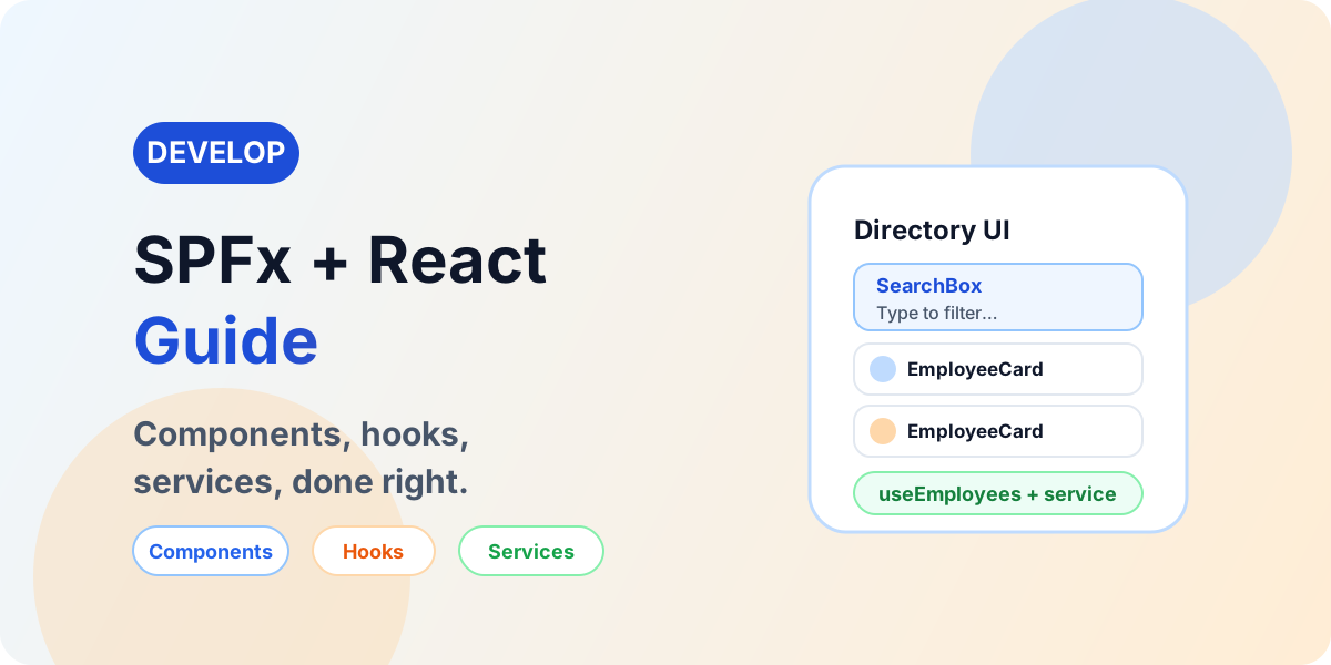
Split giant components into a container feature component orchestrating reusable presentation pieces:
EmployeeDirectory
├── SearchBox
├── FilterPanel
├── EmployeeList
│   └── EmployeeCard
├── LoadingState
├── EmptyState
└── ErrorState
Containers own data flow and state; presentation components receive props and emit callbacks. Avoid outdated mandatory terminology for these roles — the split matters, not the labels. A component doing fetching, filtering, rendering, and error handling at once is four components wearing one file.
Custom hooks
Encapsulate loading, data, error, and refresh behind hooks like useDocuments, useEmployees, or useCurrentUser. Components consume state; hooks own the lifecycle; services own the calls:
import * as React from "react";
import type { IEmployee } from "../models/IEmployee";
import type { IEmployeeService } from "../services/IEmployeeService";

export interface IEmployeesResult {
  readonly employees: IEmployee[];
  readonly loading: boolean;
  readonly error: string | null;
  readonly refresh: () => void;
}

export function useEmployees(
  service: IEmployeeService
): IEmployeesResult {
  const [employees, setEmployees] = React.useState<IEmployee[]>([]);
  const [loading, setLoading] = React.useState<boolean>(true);
  const [error, setError] = React.useState<string | null>(null);
  const [revision, setRevision] = React.useState<number>(0);

  React.useEffect(() => {
    let cancelled = false;
    async function load(): Promise<void> {
      setLoading(true);
      setError(null);
      try {
        const result = await service.getEmployees();
        if (!cancelled) {
          setEmployees(result);
        }
      } catch (failure) {
        if (!cancelled) {
          setError("Employees could not be loaded.");
        }
      } finally {
        if (!cancelled) {
          setLoading(false);
        }
      }
    }
    load();
    return () => {
      cancelled = true;
    };
  }, [service, revision]);

  return {
    employees,
    loading,
    error,
    refresh: () => setRevision((value) => value + 1)
  };
}
The revision counter gives refresh semantics without refetch hacks, and the hook stays compatible with current React used across SPFx releases. Components never see the service call — only data, loading, error, and refresh.
Service layer
The strongest structural decision in this guide. Never let a component reach SharePoint, Graph, business logic, rendering, and configuration at once — route everything through service interfaces with implementations per data source. Separation buys testability, reuse, centralized error handling, and maintainability that survives team changes:
EmployeeDirectory.tsx
↓
IEmployeeService
↓
EmployeeService
↓
PnPjs / Graph / REST
Service interfaces
Components depend on operations, never on data sources:
import type { IEmployee } from "../models/IEmployee";

export interface IEmployeeService {
  getEmployees(): Promise<IEmployee[]>;
  getEmployeeById(id: number): Promise<IEmployee | null>;
}
The React layer cares about getEmployees() — whether Graph or SharePoint answers is the service's business, which is exactly what makes data sources replaceable without touching UI code.
Dependency injection without a framework
The web part creates the service and passes it to React as a prop — production service in production, mock service in tests, test service in stories. No DI framework belongs in simple web parts; constructor-and-prop injection covers the need with zero dependencies and full explicitness.
- SPFx web part — constructs the service once.
- Passes service to React — as a typed prop.
- Production, mock, or test service — swapped at the boundary.
Models and types
Never hand raw API payloads to components. Map Graph and SharePoint responses into UI models at the service boundary:
Graph Response
↓
Service Mapping
↓
IEmployee
↓
React Component
Decoupling, type safety, simpler components, and painless API changes follow: when the endpoint reshapes, one mapping function changes instead of every component that renders a name.
SharePoint data access
React never dictates the access technology — the service layer chooses SPHttpClient with SharePoint REST, PnPjs, or Microsoft Graph per operation, and components stay ignorant of the choice. Deeper data-access guidance lives in SPFx and PnPjs, with the dedicated Graph article tracked as future content rather than a placeholder link here.
- React — renders props and state.
- Service — owns the operation contract.
- Data access technology — REST, PnPjs, or Graph per call.
- SharePoint — lists, libraries, and content.
PnPjs with React
Initialize PnPjs once with the web part context, call it only from services, select required fields, handle errors, and align versions with the SPFx release. A list-reading service shows the complete shape:
import { spfi, SPFx } from "@pnp/sp";
import "@pnp/sp/webs";
import "@pnp/sp/lists";
import "@pnp/sp/items";
import type { WebPartContext } from "@microsoft/sp-webpart-base";

export interface IDirectoryEntry {
  id: number;
  displayName: string;
}

export async function getDirectoryEntries(
  context: WebPartContext,
  listTitle: string
): Promise<IDirectoryEntry[]> {
  const sp = spfi().using(SPFx(context));
  try {
    const items = await sp.web.lists
      .getByTitle(listTitle)
      .items.select("Id", "Title")();
    return items.map((item) => ({
      id: item.Id,
      displayName: item.Title
    }));
  } catch (error) {
    throw new Error(
      "Directory entries could not be loaded. " +
        "Confirm the list exists and the user can access it."
    );
  }
}
Verify current package names against official PnP documentation before implementing. The component-to-data chain reads: component, hook, service, PnPjs, SharePoint.
Microsoft Graph with React
Reach users, groups, Teams data, and profile information through the Graph client with delegated permissions, least privilege, and distinct 401 and 403 handling — all inside services, never components:
import type { WebPartContext } from "@microsoft/sp-webpart-base";
import type { MSGraphClientV3 } from "@microsoft/sp-http";

export async function getMyProfile(
  context: WebPartContext
): Promise<{ displayName: string }> {
  const client: MSGraphClientV3 =
    await context.msGraphClientFactory.getClient("3");
  try {
    const me = await client.api("/me").select("displayName").get();
    return { displayName: me.displayName as string };
  } catch (error) {
    throw new Error(
      "Profile could not be loaded. Confirm Graph permission approval."
    );
  }
}
Verify the client pattern against current documentation for your SPFx release. Concepts: Microsoft Graph for beginners.
External APIs from React
Components call hooks, hooks call services, services call an authenticated API client, and the client calls the external API — with backend mediation wherever confidential credentials are involved. Never place client secrets or privileged API keys in React or SPFx browser code; anything shipped to the browser is visible by definition.
Fluent UI
Fluent UI earns its place for Microsoft 365-aligned buttons, text fields, dropdowns, dialogs, panels, spinners, message bars, and details-style data display with an accessibility baseline. Verify current Fluent UI and SPFx compatibility — including package names and imports — before installing anything; never blindly install the newest Fluent UI package into an SPFx project, whose supported version moves with the SPFx release.
Responsive UI
Web parts render in wide and narrow sections, different page layouts, Teams-hosted contexts where supported, and mobile browsers. Never assume viewport width equals web part width — design components against available container space, let grids reflow, and test the narrowest section the web part allows.
Property pane and React
Configuration flows editor, property pane, web part property, React props, render — with values like list name, title, page size, and display options traveling as typed props. Keep configuration responsibilities in the web part; React components consume the resulting props without owning where configuration came from.
Events and callbacks
Data flows parent to props to child; events flow child to callback to parent — document selected, filter changed, refresh requested. Reserve alternatives to prop drilling for genuinely large applications; most web parts never reach the complexity that justifies them.
React Context, judiciously
Context suits genuinely shared, rarely changing values — theme, application configuration, a shared service instance. Never pour all application state into Context; over-shared state re-renders broadly, hides data flow, and resists testing. Local state first, hooks second, Context only where sharing earns it.
State management decisions
| Situation | Answer |
|---|---|
| Simple component state | useState |
| Reusable stateful logic | Custom hook |
| Shared feature state | Context where appropriate |
| Complex application state | Evaluate a dedicated architecture or library only if justified |
Redux-style libraries are never the default for SPFx web parts — most solutions never outgrow hooks plus services.
useMemo and useCallback
Optimization tools, not mandatory boilerplate: use them where referential stability or expensive calculations materially justify the cost. Memoizing everything adds complexity, hides bugs behind stale closures, and rarely moves measurable performance — profile first, memoize second.
Rendering performance
Avoid unnecessary renders, key lists stably, paginate, virtualize large UI lists where appropriate, memoize only where justified, keep huge objects out of state, and isolate frequently changing components so typing in a search box does not re-render the world. No benchmark claims are published — measure the solution, not the framework.
Data-access performance
Data discipline beats React micro-optimization: select required fields, filter server-side, paginate, batch where appropriate, cache where appropriate, avoid duplicate requests, and never load entire large lists. Bad loads everything and filters in the browser; better filters, selects, and pages server-side, returns needed data, and renders.
Stale requests and cancellation
Unmounted components, changed search queries, and out-of-order responses corrupt state without guards. The cancellation-flag pattern in this guide's effects ignores stale results for the API approaches used here — verify cancellation support against the actual client when adopting abort-style APIs rather than copying unsupported pseudo-patterns into production.
Search and debouncing
Search-driven web parts debounce input before requesting: user types, a short quiet window passes, one service request fires, results render. Firing an API request per keystroke wastes quota and races responses; a concise debounce keeps the UI live without the storm.
import * as React from "react";

export function SearchBox(props: {
  readonly onSearch: (query: string) => void;
}): JSX.Element {
  const [value, setValue] = React.useState<string>("");
  const timer = React.useRef<number | undefined>(undefined);

  function handleChange(next: string): void {
    setValue(next);
    window.clearTimeout(timer.current);
    timer.current = window.setTimeout(() => {
      props.onSearch(next);
    }, 300);
  }

  return (
    <input
      type="search"
      aria-label="Search employees"
      value={value}
      onChange={(event) => handleChange(event.target.value)}
    />
  );
}
Pagination
Page large SharePoint datasets with next/previous, load-more, or justified infinite scrolling — where the data layer honors the underlying API's paging mechanism. Never invent universal page-size recommendations; page by what the API supports and the UI needs.
Caching
Cache reference data, configuration, and slow-changing data — while respecting staleness, user-specific scoping, permission sensitivity, and invalidation. Never cache sensitive or per-user privileged data indiscriminately; a cache hit that leaks another user's data is a security incident, not an optimization.
Theming
Respect SharePoint and Microsoft 365 themes instead of hard-coding palettes that clash with tenant branding. Verify current SPFx theming APIs before publishing theme-reading code — theme surfaces move with releases, and hardcoded colors break dark and high-contrast experiences first.
CSS and styling
Follow the styling approach your SPFx release generates and supports: component-scoped styles, CSS modules where generated, Fluent UI, and theme-aware values. Avoid global CSS and never manipulate SharePoint platform styles — unsupported overrides break on service updates and leak across pages.
Accessibility
Semantic HTML, keyboard navigation, focus management, form labels, ARIA where necessary, accessible dialogs, screen-reader behavior, contrast, error messaging, and loading announcements where relevant — tested with keyboard-only interaction through every custom component. Accessibility is implementation quality from the first sprint, not a final checklist item.
Forms in React
Controlled inputs where appropriate, validation, required fields, submission state, error state, success state, and duplicate-submission prevention. Keep this guidance component-level; no forms framework is prescribed, and framework choice never excuses missing states.
Form validation layers
Client-side UX validation (formats, required fields, instant feedback) and server, API, or business validation (authority, uniqueness, permissions) are separate layers. Never rely on browser validation alone for security-sensitive rules — the service layer re-validates everything that matters.
Dialogs and panels
Details, editing, confirmation, configuration, and secondary workflows belong in accessible Fluent UI dialogs or panels where compatible — focus-trapped, keyboard-dismissible, and labeled. Custom modal implementations must re-prove every behavior the platform components provide for free.
List and table experiences
Loading, sorting, filtering, paging, selection, empty state, responsive behavior, and accessibility — without loading massive datasets simply because React can render rows. The data layer pages; the table renders pages; sorting and filtering push server-side wherever the API allows.
Reusable components
LoadingState, ErrorState, EmptyState, ConfirmDialog, SearchBox, Pagination, StatusBadge, and UserPicker wrappers earn reuse across web parts. Reuse where shapes genuinely repeat; over-abstraction — one mega-component with twelve modes — makes code harder to understand than duplication it replaced.
Error handling architecture
Errors travel React, hook, service, API — then back as classified states: API error, service classification, hook state, React error experience. Differentiate 401, 403, 404, throttling, server errors, network failures, and configuration problems, because each routes to a different owner and fix. Raw stack traces never reach users.
401 and 403 in SPFx React
Conceptually, 401 implicates authentication or token issues while 403 implicates authorization or permission issues — but never present these as universal diagnoses. In SPFx specifically, investigate SharePoint permissions, Graph scopes, API permission approval, current user access, token audience, and external API authorization, and link Graph-specific troubleshooting onward rather than duplicating it here.
React Error Boundaries
Error Boundaries catch rendering crashes in the tree below them — accurately per the React version your SPFx release supports — and render a fallback instead of unmounting the page. They do not catch API failures, event-handler throws, or async rejections; data errors stay in hook state, boundaries stay for render crashes. Both layers, each doing its own job.
Logging
Components never scatter uncontrolled console logging through production code. Keep development diagnostics local, log production-safe categories with correlation IDs where available, and never log tokens, secrets, or sensitive user data beyond need. Services log; components render; support reads logs, not screenshots of blank screens.
Security checklist
Standing rule: anything delivered to the browser is visible to the user. Design as if every bundle will be read — because it can be.
User-generated HTML and XSS
Rendering user or API-provided HTML carries cross-site scripting risk. Never casually reach for raw HTML injection in React; prefer text rendering and safe components. Where HTML rendering is genuinely required, sanitize at a trust boundary, restrict allowed markup, and document why the exception exists. No insecure examples are published here.
Testing components
Test rendering, interactions, loading, empty, and error states, service success and failure, and permission-sensitive behavior — using the test tooling actually compatible with the current SPFx ecosystem, verified before any installation instructions are followed. Untested states are unshipped states wearing a green build badge.
Mock services
Interfaces make testing trivial: production renders through the real service into Graph, while tests render the same components through a mock service into static data. This single example justifies the entire service-layer discipline — UI tested without tenants, tenants untouched by tests:
Production:  React → EmployeeService → Graph
Testing:     React → MockEmployeeService → Static Test Data
import type {
IEmployeeService
} from "./IEmployeeService";
import type { IEmployee } from "../models/IEmployee";
export class MockEmployeeService implements IEmployeeService {
public async getEmployees(): Promise<IEmployee[]> {
return [
{ id: 1, displayName: "Ava", jobTitle: "Engineer" }
];
}
public async getEmployeeById(id: number): Promise<IEmployee | null> {
const all = await this.getEmployees();
return all.find((entry) => entry.id === id) ?? null;
}
}Development versus production
Tenants, URLs, list IDs, API endpoints, permissions, data volume, user permissions, and configuration all differ between development and production. A web part working for its developer proves nothing about production users — validate configuration resolution, permission behavior, and data scale in production-like conditions before sign-off.
Test with multiple personas
Where permissions matter, exercise owner, member, visitor or read-only, and restricted personas. Developer accounts are typically the most privileged identities in the tenant; testing only as an administrator certifies the experience for exactly one user who will never file a support ticket.
Example: employee directory architecture
Illustrative architecture tying this guide together — one scenario, every layer. An employee directory web part on a SharePoint page renders through an EmployeeDirectory component, reads through a useEmployees hook and an employee service interface into a Graph-backed implementation, and presents search, filters, cards, loading, empty, and error experiences:
- SharePoint page — hosts the web part.
- SPFx web part — context, properties, service construction.
- EmployeeDirectory React component — SearchBox, FilterPanel, EmployeeList.
- useEmployees hook — data, loading, error, refresh.
- IEmployeeService — the contract components depend on.
- GraphEmployeeService — delegated Graph implementation.
- Microsoft Graph — users behind approved scopes.
Example: component consuming the hook
export function EmployeeDirectory(props: {
  readonly service: IEmployeeService;
  readonly title: string;
}): JSX.Element {
  const { employees, loading, error, refresh } =
    useEmployees(props.service);

  if (loading) {
    return <LoadingState message="Loading employees…" />;
  }
  if (error) {
    return (
      <ErrorState
        title="Directory unavailable"
        message={error}
        onRetry={refresh}
      />
    );
  }
  if (employees.length === 0) {
    return <p>No employees found.</p>;
  }
  return (
    <section>
      <h2>{props.title}</h2>
      <EmployeeList employees={employees} />
    </section>
  );
}
Every branch from the state model renders; the hook owns lifecycle; the service owns data. Small, typed, and complete — the template for production components.
Complete architecture
SHAREPOINT ONLINE
↓
SPFx WEB PART
↓
REACT
├── Search
├── Filters
├── List
├── Loading
├── Empty
└── Error
↓
CUSTOM HOOK
↓
SERVICE INTERFACE
↓
SERVICE IMPLEMENTATION
├── PnPjs → SharePoint
├── Graph → Microsoft 365
└── API Client → Business System
↓
MICROSOFT ENTRA ID

Surrounded by: Configuration · Security ·
Accessibility · Logging · Performance
Bad versus better architecture
| Bad: one component does everything | Better: layered responsibilities |
|---|---|
| UI, API calls, business logic, configuration, error handling, and permissions in a single file | SPFx hosts; React renders; hooks hold state; services call APIs |
Better is architectural guidance — separation of concerns — never a mandatory file count or folder structure. Small web parts legitimately collapse layers; the discipline is knowing which layer each line belongs to.
Production readiness checklist
Architecture: components focused; service layer used where justified; models and interfaces defined; configuration separated.
State: loading, empty, and error handled; async race conditions considered.
Data: required fields only; filtering and paging handled; duplicate calls minimized; large data considered.
Security: no secrets; permissions reviewed; external APIs secured; inputs and outputs reviewed.
UX: responsive; accessible; clear loading state; useful errors.
Operations: logging considered; multiple personas tested; production configuration validated; ownership documented.
Common SPFx and React mistakes
| Mistake | Corrective direction |
|---|---|
| Everything in one component | Split containers, presentation, hooks, and services. |
| API calls scattered through UI | Route every call through service interfaces. |
| Incorrect useEffect dependencies | List every read value; stabilize services at construction. |
| No loading state | Model loading explicitly with indicators or skeletons. |
| No empty state | Separate empty-data messaging from errors. |
| No error state | Classify failures with safe messages and retry. |
| Loading entire lists | Select, filter, and page server-side. |
| Hard-coded URLs | Externalize to properties and environment configuration. |
| Secrets in React | Move to a secured backend; redesign the integration. |
| Global mutable variables | Pass values through props, hooks, and services. |
| Overusing React Context | Local state first; Context only where sharing earns it. |
| Adding Redux unnecessarily | Hooks plus services cover nearly all web parts. |
| Memoizing everything | Profile first; memoize where measurements justify. |
| Ignoring accessibility | Keyboard, focus, labels, and contrast from the first sprint. |
| Ignoring tenant theme | Respect themes; never hard-code clashing palettes. |
| Testing only as admin | Exercise every persona that will use the solution. |
| Using unsupported React or package versions | Match versions to the targeted SPFx release. |
| Blindly upgrading dependencies | Compatibility-test upgrades against the SPFx release. |
Migration and modernization connection
Legacy JavaScript selected for SPFx rebuilds lands in exactly this architecture: requirement analyzed, components composed, hooks holding state, services calling supported APIs. Depth: Script Editor to SPFx modernization, Classic SharePoint to Modern SharePoint, and the migration hub.
- Legacy JavaScript — classified by function.
- Business requirement — defended by an owner.
- SPFx selected — simpler architectures ruled out.
- React architecture — this guide's layers.
- Services — supported APIs behind interfaces.
- Supported APIs — the modernization lands safely.
PnPjs and Graph next steps
React UI complete? Continue into SPFx and PnPjs for service-layer data access — lists, CRUD, filtering, paging, batching, files, and search — and SPFx and Microsoft Graph for delegated permissions, users, groups, paging, and throttling. Microsoft Graph for beginners still carries Graph fundamentals.
Building a complex SPFx and React solution
If you are working through component architecture, SharePoint data, Microsoft Graph, authentication, performance, or enterprise SPFx requirements, share the technical challenge with nextM365: Discuss Your SPFx Project.
Continue with Explore SPFx, the SPFx complete guide, Script Editor to SPFx modernization, and Classic to Modern SharePoint.
Related resources
Topics covered
React · Project Structure · Permissions · ALM · Security
Frequently asked questions
Does SPFx use React?
React is the standard, best-supported UI layer for SPFx web parts, though the framework itself does not mandate it. Current guidance, samples, and the patterns in this guide assume React unless a project has a specific reason to differ.
Is React required for SPFx?
No. Web parts can use any framework or none. React is recommended because it matches current samples, Fluent UI integration, and the hiring and maintenance mainstream for SharePoint development.
Which React version does SPFx support?
The supported React major version moves with the SPFx release — React 18 support arrives in the SPFx v1.24 preview line. Never upgrade React independently inside an SPFx project; match the version your SPFx release supports.
Can React Hooks be used in SPFx?
Yes. Functional components with hooks such as useState and useEffect are the recommended modern pattern for SPFx React development, replacing legacy class-component approaches for new code.
How do you use useEffect in SPFx?
For side effects such as initial data loading and responding to changed dependencies: run the service call inside the effect, list every referenced value in the dependency array, and guard state updates so unmounted components and stale responses cannot corrupt state.
Should API calls be made directly from React components?
No. Route data access through a service layer behind interfaces. Components render props and state; services own PnPjs, Graph, REST, and external calls with centralized error handling.
Can SPFx React use PnPjs?
Yes, from the service layer — never scattered through components. Initialize PnPjs with the web part context, select only required fields, handle errors, and align the PnPjs major version with the targeted SPFx release.
Can SPFx React use Microsoft Graph?
Yes, through the Graph client with delegated permissions approved by a tenant administrator. Request least-privilege scopes and handle 401 and 403 distinctly in the service layer.
Can SPFx React call external APIs?
Yes, through Microsoft Entra authentication against secured endpoints, with backend mediation wherever the API cannot authenticate the user directly. Never embed secrets in React or SPFx browser code.
Should Redux be used with SPFx?
Almost never by default. Component state, custom hooks, and React Context cover the vast majority of web parts. Evaluate a dedicated state library only when justified complexity — shared mutable state across many features — actually exists.
How do you handle errors in SPFx React?
Model loading, empty, and error states explicitly; classify service failures by cause; keep raw API details out of the UI; and reserve Error Boundaries for rendering crashes, not data-call failures.
Can secrets be stored in React or SPFx?
No. Anything delivered to the browser is visible to the user, so client secrets, passwords, and privileged keys belong in a secured backend or managed-identity flow.
Sources
- Microsoft Learn: Sharepoint Framework Overview, Microsoft
- Microsoft Learn: Build A Hello World Web Part, Microsoft
- Microsoft Learn: Release 1.24.0, Microsoft
Have a Microsoft 365 topic idea?
Share article suggestions, community session ideas, corrections, or real-world scenarios for future nextM365 learning notes.
Keep learning Microsoft 365
Explore more practical tutorials for SharePoint, Power Platform, Copilot Studio, migration, automation, governance, and security.
Continue learning
Related tutorials